One of the most popular tools for creating stunning data visualizations is Tableau. Tableau is a powerful data visualization tool that enables you to connect to various data sources, explore, analyze, and create interactive visualizations. I created a Tableau dashboard using the “Getting Started” training videos provided by Tableau. Note: Tableau offers a 14-day free trial or 1 year of free access for students. These tutorials showcase Tableau’s user-friendly interface and extensive feature set, I can see why it is so popular amongst professionals.
Notable Features in Tableau:
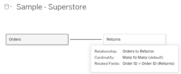
Tableau automatically links data between tables. In the “Sample – Superstore” dataset, when linking the Orders and Returns sheets, Tableau automatically finds the relationship.
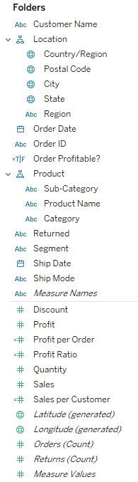
It’s easy to sort columns into groups/hierarchy’s and hide any unused columns. Also, Tableau labels the columns by the type of data and it’s easy to add calculation columns (denoted by =#).
Making visualizations in Tableau is just a few clicks. The data is easy to format into percent, dollars, decimal places and the visualizations were easy to add filters, labels, and change colors.
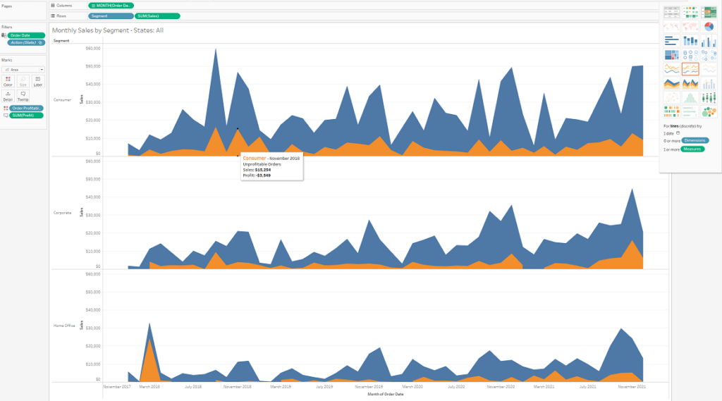
Tableau is quick and easy to use. Creating an interactive dashboard for this dataset took 20 minutes and I didn’t even have to write a single line of code.
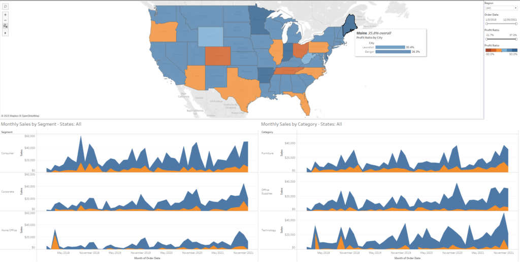
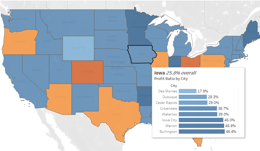
Using the Tableau tutorials, I was able to create a interactive dashboard of the “Sample – Superstore” dataset. The dashboard includes visuals for profit by region, profit by segment, and profit by category. The dashboard also includes filters for region, dates, and profit. A data scientist or even an executive could look at this dashboard and draw quick conclusions on which region, segment, or category is profitable. A marketer could use the dashboard to figure out when to run a promotion. I was blown away by this quick introduction to Tableau and look forward to making more in-depth dashboards. The Tableau workbook and “Sample – Superstore” dataset are posted here on my Github.